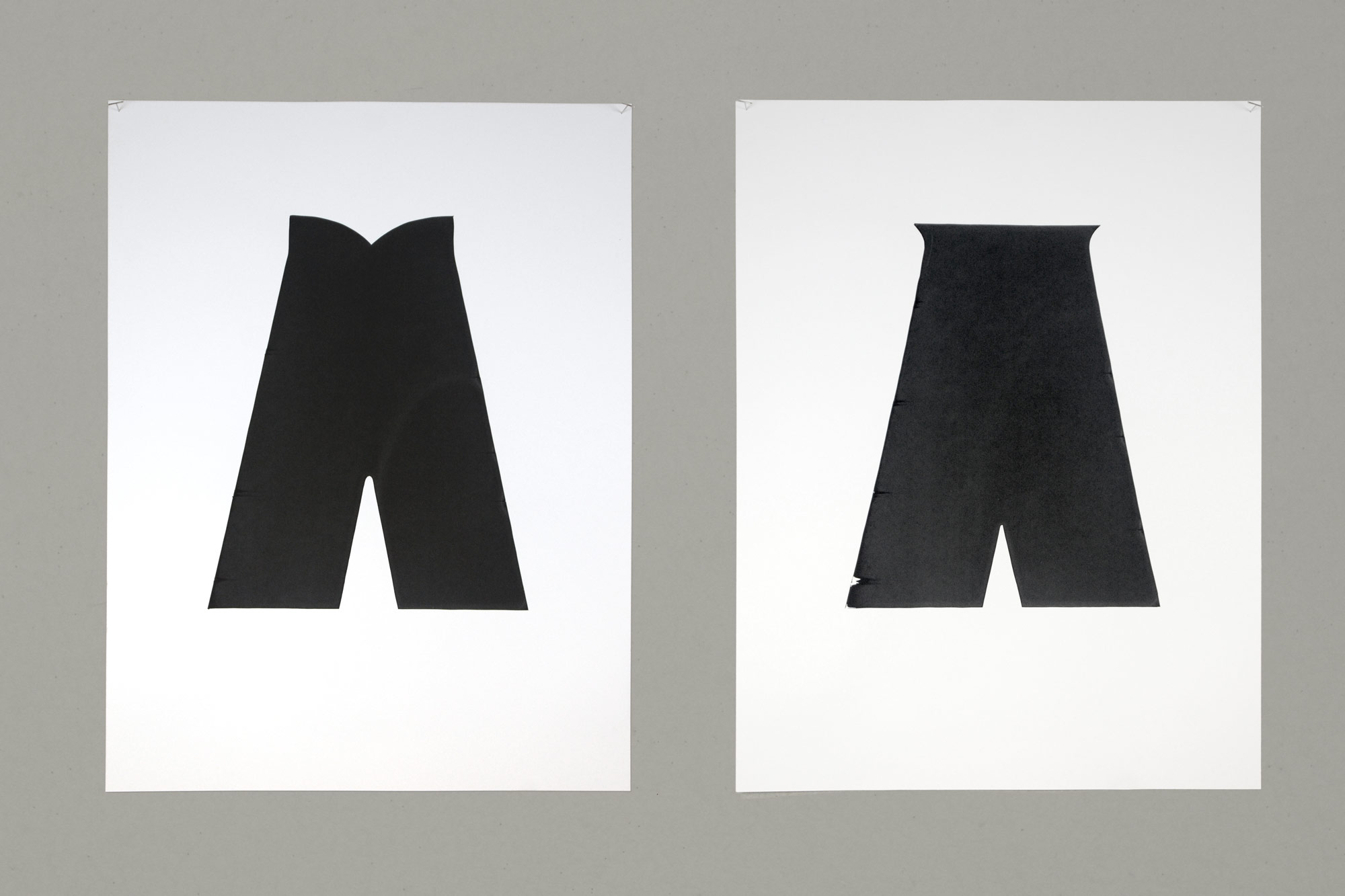
 Details of two versions of the letter A
New Orleans streets are marked with tiles embedded in the sidewalk spelling out the names of the streets. This wayfinding system dates back to the turn of the 20th century and has become well known.
In 2014 I initiated a project digitizing the type on these tiles. In researching and examining these tiles, two nearly identical but distinct sets of letters emerged. One of these sets has a loose, somewhat organic quality. The other is more geometric or mechanical.
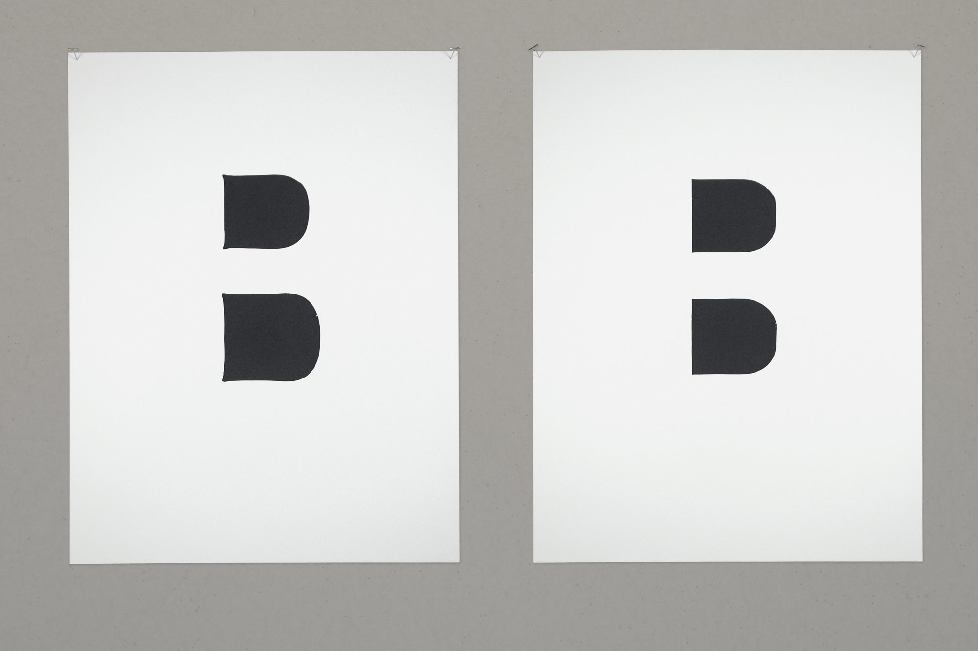
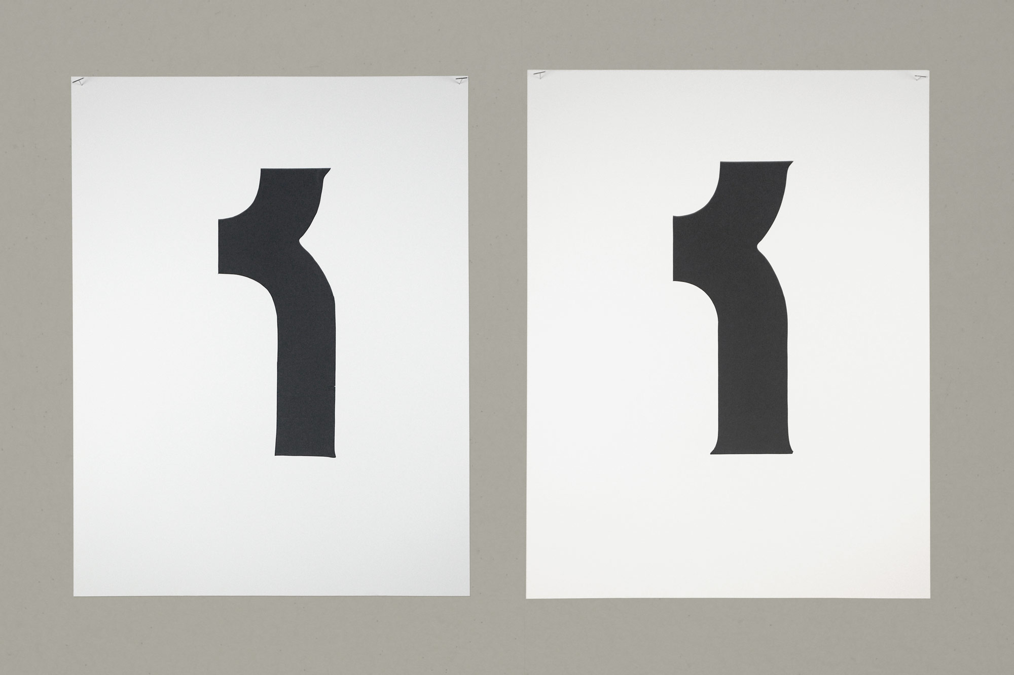
As a way of looking closer and understanding those -differences, I created a set of 19×25 inch screen prints – exhibited at Loyola’s Diboll Gallery – of details of the different letterforms. Each pair of prints shows two distinct forms of one letter.
The story of these tiles, including their minor differences, is related to the story of the city’s own modernization. And this research contributes to the body of knowledge around New Orleans’ visual history.
 Diagram showing where the detail originates in the letter
 The counters to two versions of the letter B
 Comparisons of details from two different R versions
© 2019 Daniel Lievens